
Today I’m delighted to welcome back to the blog, author Peter Jones, whose latest novel – My Girlfriend’s Perfect Ex-Boyfriend – came out earlier this month. You can read my review here.
One of the things that can make or break a book is the cover. With this in mind I asked Peter how the cover for MGPEB came about. Here’s what he had to say…
Book covers.
I hate them!
No really, I do. Because the age old advice – never judge a book by the cover – is universally ignored.
I went through hell and back with the designer working on the covers for my first two novels (you can read about those experiences here and here), but when it came to this latest book, I was pretty sure it would be a walk in the park. And here’s why:
In the opening chapter of My Girlfriend’s Perfect Ex-Boyfriend, there’s a silly joke about our hero’s girlfriend’s ex-boyfriend being soooo perfect that there’s probably a Tibetan temple dedicated to him. It would be your standard Tibetan temple; chanting monks, a sixty foot golden statue – only obviously the statue would have an extra pair of arms so that Sebastian (the perfect ex-boyfriend) could hold various symbols and representations of all the wondrous gifts that he brings to the world.
That, I thought, would make a great cover for the book. I put all this in an email to my wonderful designer and this is what he came back with.

I was pleased. Okay so it’s not perfect by any means. It’s quite difficult to read some of the words against the patterned background, but as a concept it’s pretty darn close to what I had in my head. However, even though I really like covers that wrap around the spine and continue on the back, it seemed a shame that we couldn’t see all of Sebastian. Plus I had a nagging feeling that despite the cartoon style grin, this cover didn’t necessarily scream romantic comedy at anyone casually looking for a new book to read.
So with that in mind I decided to familiarise myself with covers of other women’s contemporary humorous fiction, written by male novelists, and from a male viewpoint. And here’s what I found:
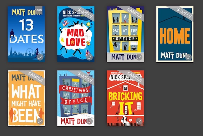
I think you’ll agree, there’s definitely a style. Lots of flat colour. Slightly cartoony. Silhouettes seem popular. Oh, and all of them (with the possible exception of two) are EASY TO READ – particularly when reduced to a thumbnail. So – Mr Cover Designer Man – would it be possible to take that original design for my cover, and tweak it so that it wouldn’t look out of place when filling that gap in the bottom right hand corner?
Oh, and could I have a couple of ideas to pick from? Thank you.
Here’s what I got back.

Wow!
Now remember, these are just rough-and-ready sketches, so any weird blobs or lines wouldn’t be there on a final finished version, but even so, my gob was well and truly smacked. I loved them. All of them. Not equally of course, but each one was a massive improvement on the original, and I was utterly convinced that with a bit of tweaking we had a finished cover. All I had to decide was which one.
It was an easy choice.

Now obviously this one is a clear winner. No doubt in my mind. I was a little worried about my name getting lost at the bottom there, but really the title’s the more important thing.
However, just to be absolutely sure I’d picked the right one, I decided to ask some other authors. Specifically romantic fiction authors. Specifically female romantic fiction authors. I uploaded all six new designs (plus the original design) into one of the private facebook groups for the Romantic Novelists Association and asks my fellow novelists to vote.
I’m not going to lie to you… I was shocked at the result.
With the exception of one person (Hello Sue Lovett), every single woman chose one of the following:

This left me scratching my head. I was so sure my choice was the better cover and yet here I was being out-voted by 10 to 1! (Incidentally, Sue chose the original, first design).
So I asked my partner what she thought. Along with all her (female) work colleagues, she too picked one of the two covers above, with the majority of her colleagues picking the version on the right.
Not only that, but almost every woman I’d asked took the time to tell me that, although they liked the design, they hated Sebastian’s orange tie! One woman (Hello Virginia) said it reminded her of Halloween!!
Still reeling from this new information I decided to ask my male friends which one they would go for. With the exception of one person (Hello Patrick – there’s always one isn’t there) they all picked the same one I’d chosen, or a near relative.
So this left me with a rather interesting conclusion and a potentially troublesome conundrum.
Conclusion: Different covers appeal to male and female readers.
Conundrum: Do I pick a female cover, or a male one?
It really wasn’t a hard choice if I’m honest.
I write Women’s Contemporary Humorous Fiction. 90% of my readers (possibly more) are women. If I’m going to continue trying to make a living out of this writing lark then I had to choose the cover that the RNA ladies and my girlfriend’s colleagues had gone for.
Thing is, I didn’t like it.
The strap line seemed sort of lost at the bottom, and my name seemed a bit lonely up there at the top. And the two new silhouettes (which are supposed to represent Adrian and his girlfriend Paige), well they just seemed to be plonked either side of the word PERFECT for no reason.
I went back to Mr Cover Design Man with these thoughts and a couple of days later I went back to my girlfriend and novelist buddies with these four variations:

At first glance there doesn’t appear to be much of a difference between them so let me talk you through the key points.
- In three of the designs Adrian and Paige have been resized to create a sense of perspective. Now we have a ‘scene’ being illustrated. In fact, in two of the designs they even have their own shadows!
- Two of the designs obviously have borders whilst two don’t, but in all of them the colour of the tie has changed to match the word perfect, and my name has been tinkered with to make it look more ‘fun’.
- Finally in one version the grin has made a reappearance, because I like the grin. I thought it was funny and would make people laugh. Turns out I was wrong. Most people told me the grin was off-putting and scary.
Everyone liked the pink tie though. And aside from comments about my name being hard to read, and the strap-line being too long, everyone chose either the second or third version.
And those comments were easily addressed.
I present to you, the final version:
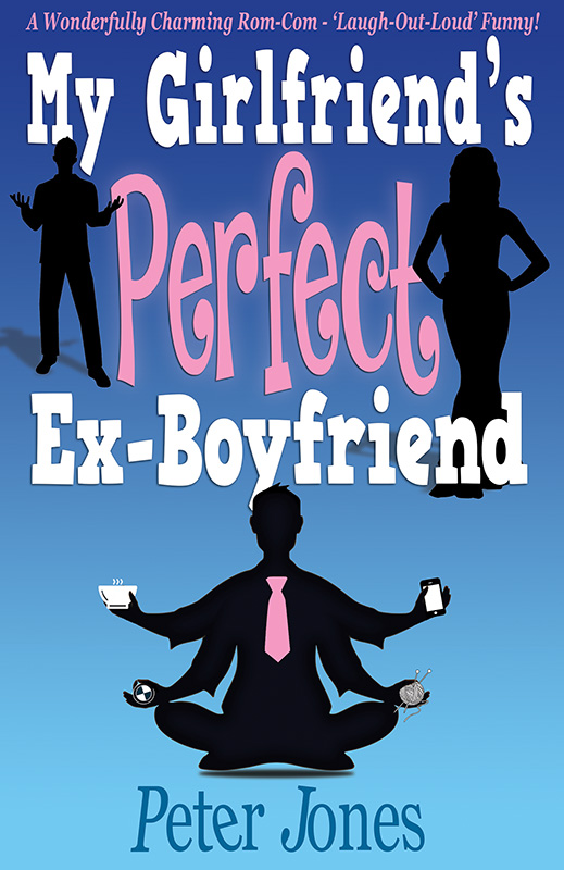
And I have to say… I love it. Of all the covers on all my books, this one is most definitely my favourite.
It’s perfect.
Or is it?
 Hot news!
Peter’s latest novel, My Girlfriend’s Perfect Ex-Boyfriend, is just 99 pennies for a limited time only. Click or tap here to visit amazon or type BuyTheBook.TODAY into your web browser.
And you can follow Peter on social media via the links below
- Latest book: http://BuyTheBook.TODAY
- amazon: https://www.amazon.co.uk/Peter-Jones/e/B004RMHCQC/
- website: http://www.peterjonesauthor.com
- facebook: http://www.facebook.com/peterjonesauthor
- twitter: http://www.twitter.com/peterjonesauth

Great post about deliberating on covers! And I already have it downloaded after your mention last week!!!!
LikeLiked by 1 person
Yay! Thanks for that, Ritu. I know Peter will be over the moon 🙂
LikeLike
😊
LikeLike
Aww. Thanks Ritu. Really hope you enjoy the book 🙂
{waves from the surface of the moon}
LikeLiked by 1 person
Im sure I will love it!
LikeLiked by 1 person
Having just re-covered all my books and worked closely with the cover artist, (‘d say covers are a matter of taste, but at the end of the day, you, the writer, have to be proud of it. I’ve had some awful covers *imposed* on me by publishing houses…and some great ones. I like that now, we can work with the designer to get what we like! Great cover, btw!
LikeLiked by 2 people
I love Peter’s covers, they are always so much fun and very eye catching. I also LOVE your new covers, Carol. Thanks for stopping by x
LikeLike
Thanks Carol 🙂
LikeLiked by 1 person
I’m a man last time I looked and my immediate response was the female choice, I wouldn’t have gone anywhere near the toothy smile and orange. The final choice a winner in that as a reader of many of Nick Spalding and a couple Matt Dunn books, it fits with expectation. Nick’s sales are phenomenal, to both men and women, I don’t get the ‘women’s contemporary fiction’ point at all?
LikeLiked by 1 person
So interesting, I would have gone for that first one. I have a total fetish for orange an aversion to pink though so what do I know?! 😂
LikeLiked by 1 person
Interesting! You and my pal Sue are in some sort of special ‘orange’ club together.
LikeLiked by 1 person
Orange is a wonderful colour Peter, it’s very underrated!
LikeLiked by 1 person
I will bear that in mind for my *next* book 🙂
LikeLiked by 1 person
Hahaha, I’m with you on all things pink and yet it’s been creeping up on me more and more over the years! 😉
LikeLike
I love peter’s posts and can’t wait to read this one! Love the final cover too.
LikeLiked by 1 person
Phew! 🙂
LikeLiked by 1 person
Thanks, Linda. It’s such a fun and vibrant cover isn’t it – matches the story theme perfectly.
LikeLiked by 1 person
Fascinating post. Have downloaded the book and am off on holiday tonight so will have time to read it and make inroads into the tbr pile.
LikeLiked by 1 person
Thanks Mary. really hope you enjoy the book. Have a lovely holiday 🙂
LikeLiked by 1 person
Thank you.
LikeLike
Yay! Hope you enjoy it, Mary – book and holiday! 😉
LikeLiked by 1 person
Thanks, Shelley. I’ll probably not be on social media much so don’t worry if you don’t see any comments from me!
LikeLiked by 1 person
Really interesting, Shelley! I picked a style for my covers and just used photos, initially. Now I’ve had to involve an artist – I used 99 Designs. I loved the subtle variations with all of these…
LikeLiked by 1 person
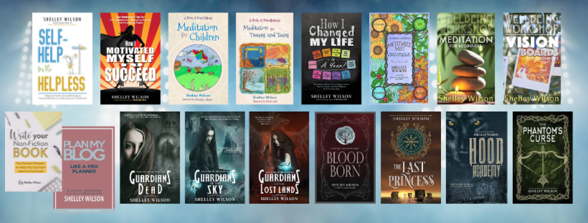
Thanks, Noelle. Covers are so important aren’t they – I think Peter has done a wonderful job. I’m fortunate that he was able to design the majority of my non-fiction covers which continue to receive high praise x
LikeLike
I’ve just had the cover designed for my first book using a painting created specifically for the book by my brother. I was amazed at the quality of what the designer came back with and it’s made me even more excited to have a copy of my own book in my hands. A high quality cover that grabs your attention is very important.
LikeLiked by 1 person
And I’m with Peter – the ‘male’ favourite stood out for me. Good to read how the final version evolved and it looks great. Good luck with it!
LikeLiked by 1 person